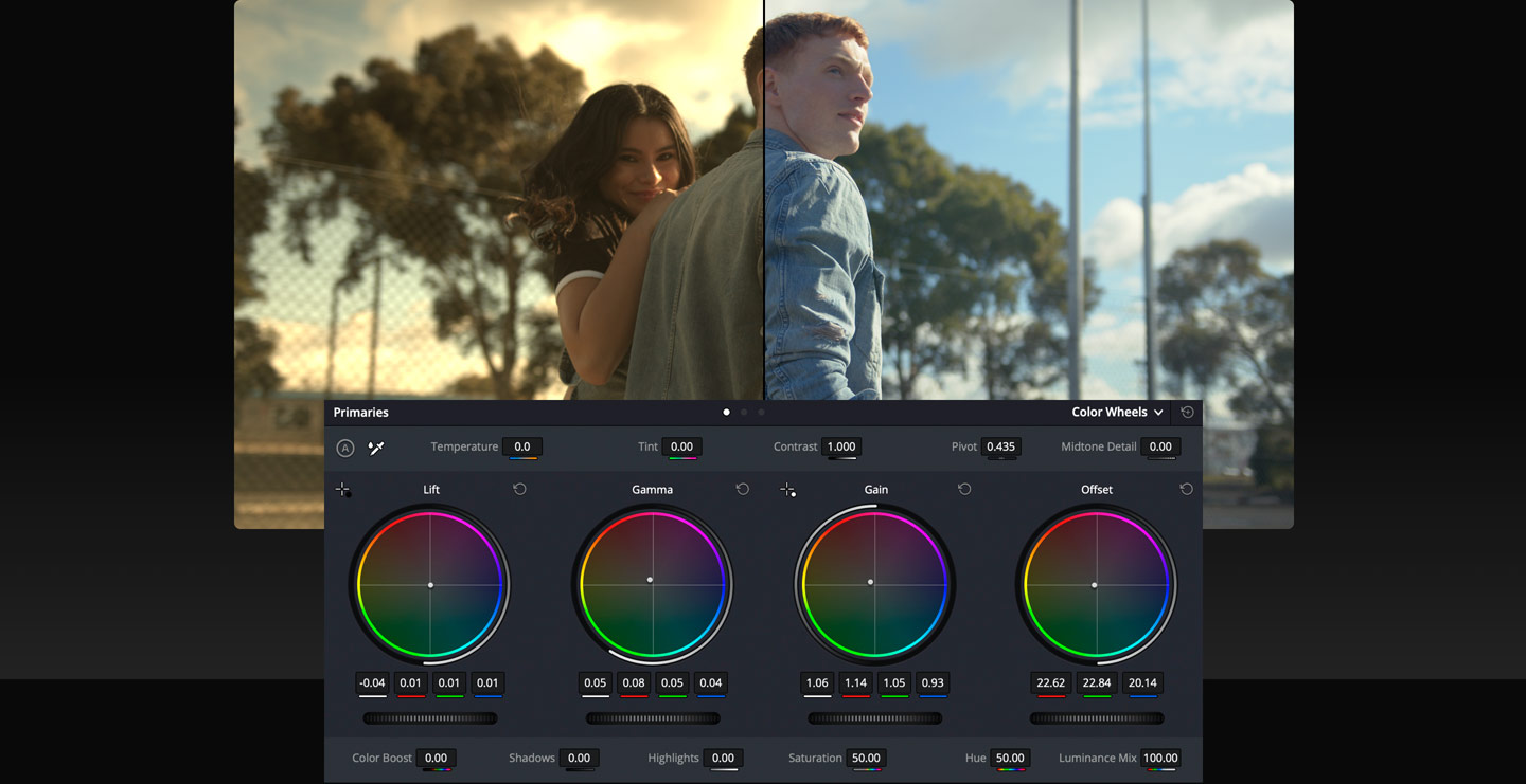
Balancing color is the first step in the color correction process. This is done with the primary correction tools, which are located at the bottom left of the screen. Primary tools affect the entire image and you use them to adjust brightness and color levels to remove unwanted tints and to create a neutral starting point. Each wheel is mapped to a different part of the tonal range. You can simply click and drag inside a wheel to adjust that range’s color, then use the master dial below the wheel to change its overall level. This palette also has adjustment controls, primary bars and log controls. Once shots are balanced, you can begin the creative grading process to create unique "looks".

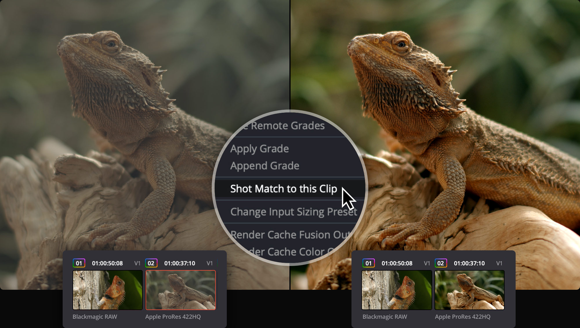
Balanced and matched shots make content from different cameras look consistent. You can use the auto balance tools to quickly balance a group of similar shots. Simply click the auto color button at the left of the color wheels palette to balance the shot’s color and contrast. You can also match the color between different shots. Select a clip, right click on another clip, and select "Shot Match to This Clip" from the menu. Resolve will match the color, contrast and brightness of the clip you’re working on with the one you’ve selected. If a shot contains a chip chart, click on the color match icon in the toolbar, select the type of chart used, line it up on the image and click match!

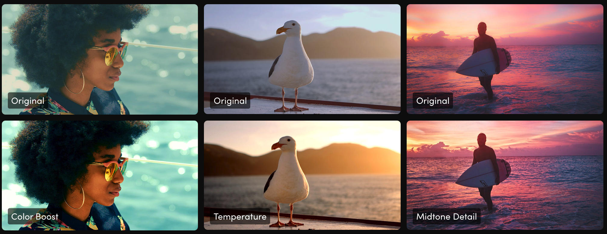
The primary palette contains incredibly powerful primary adjustment possibilities that let you quickly adjust image contrast, saturation, hue, temperature, tint, midtone detail, color boost shadows, highlights and more. They’re an indispensable set of creative tools that I use every day! For example, midtone detail lets you adjust contrast in areas with high edge detail to increase or decrease image definition or sharpness. Color boost, also referred to as vibrance, intelligently adjusts areas of an image with low saturation, resulting in a subtle and more natural looking increase of color.
